Introduction
HomejQuery Mobile Overview
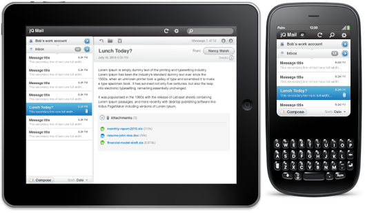
jQuery’s mobile strategy can be summarized simply: Delivering top-of-the-line JavaScript in a unified User Interface that works across the most-used smartphone web browsers and tablet form factors.
The critical difference with our approach is the wide variety of mobile platforms we’re targeting with jQuery Mobile. We’ve been working hard at bringing jQuery support to all mobile browsers that are sufficiently-capable and have at least a nominal amount of market share. In this way, we’re treating mobile web browsers exactly how we treat desktop web browsers.
To make this broad support possible, all pages in jQuery Mobile are built on a foundation of clean, semantic HTML to ensure compatibility with pretty much any web-enabled device. In devices that interpret CSS and JavaScript, jQuery Mobile applies progressive enhancement techniques to unobtrusively transform the semantic page into a rich, interactive experience that leverages the power of jQuery and CSS. Accessibility features such as WAI-ARIA are tightly integrated throughout the framework to provide support for screen readers and other assistive technologies.
