Theming lists
HomeAll the standard button swatches can be applied to lists. The framework assigns a default list theme swatch of "c" (silver in the default theme) and swatch "b" (blue in default theme) for dividers. Below is a default themed list.
<ul data-role="listview" data-inset="true">
Theming list items
The list item color scheme can be changed to any button color theme swatch by adding the data-theme attribute to the list, and setting the letter theme swatch. Here is the same list above with the "a" swatch applied.
<ul data-role="listview" data-inset="true" data-theme="d">
Data-theme attributes also work at the LI-level, for styling a single item.
Theming dividers
The theme for list dividers can be set by adding the data-dividertheme to the list and specifying a swatch letter. Here is an example of the same list above with swatch "d" set on the dividers.
<ul data-role="listview" data-inset="true" data-theme="d" data-dividertheme="c">
Theming count bubbles
The theme for count bubbles can be set by adding the data-counttheme to the list and specifying a swatch letter. Here is an example with swatch "e" set on the dividers.
<ul data-role="listview" data-inset="true" data-theme="a" data-dividertheme="d" data-counttheme="e">
Theming icons
The default icon for each list item is arrow-r. To override this, set the data-icon attribute on the desired list item to the name of a standard icon. To prevent icons from appearing altogether, set the data-icon attribute to "false".
<li data-icon="info"><a href="#">Notices</a></li>
<li data-icon="alert"><a href="#">Alerts</a></li>
<li data-icon="false"><a href="#">All Notifications</a></li>
- Divider
- Notices
- Alerts
- All Notifications
Theming split buttons
For split lists which a second button, the framework default to "b" for the theme swatch (blue in the default theme) Here is a default split list:
-
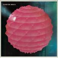
Broken Bells
Broken Bells
Purchase album -

Warning
Hot Chip
Purchase album
<ul data-role="listview" data-inset="true" data-splittheme="a">
To specify the color swatch for the icon button on the right, add the data-splittheme to the list and specify a swatch letter. This attribute can also be added to individual split inside list items by adding a data-theme attribute to specific links (see second list item).
-
Broken Bells
Broken Bells
Purchase album -
Warning
Hot Chip
Purchase album
The icon for the split theme can set at the list level by adding the data-spliticon to the list and specifying a standard icon. This attribute can also be added to individual split inside list items by adding a data-icon attribute to specific links (see second list item).
<ul data-role="listview" data-inset="true" data-splittheme="a" data-spliticon="plus">
-
Broken Bells
Broken Bells
Purchase album -
Warning
Hot Chip
Purchase album
Examples of all basic list swatches
A swatch
B swatch
C swatch
D swatch
E swatch